
Every board packet I’ve ever seen has the spreadsheet. You know the one: gift totals by month, twelve columns across, a total at the bottom, maybe a percent change somebody worked out by hand in the margin. It’s accurate. It’s complete. And almost nobody reads it.
That isn’t the board’s fault. A table of numbers asks the reader to do the analysis: find the trend, compare this year to last, figure out which number matters. A volunteer board member opening the packet in the parking lot ten minutes before the meeting isn’t going to do that. They’ll find the total, nod, and move on. The finding that should have changed the conversation stays in row 47.
A chart does the comparison for them. A line that climbs is a line that climbs; nobody has to subtract. Bars of wildly different heights tell you something’s lopsided before you’ve read a single label. That isn’t dumbing it down. It’s putting the analysis where it belongs, with the person who has the data and the time, instead of handing it to a reader who has neither.
What that looks like
Here’s a sample. It’s a one-page donor report for a food nonprofit that doesn’t exist, built from six years of made-up gift records. The spreadsheet behind it has almost seven thousand rows. The page has four numbers, two charts and three things to do next.
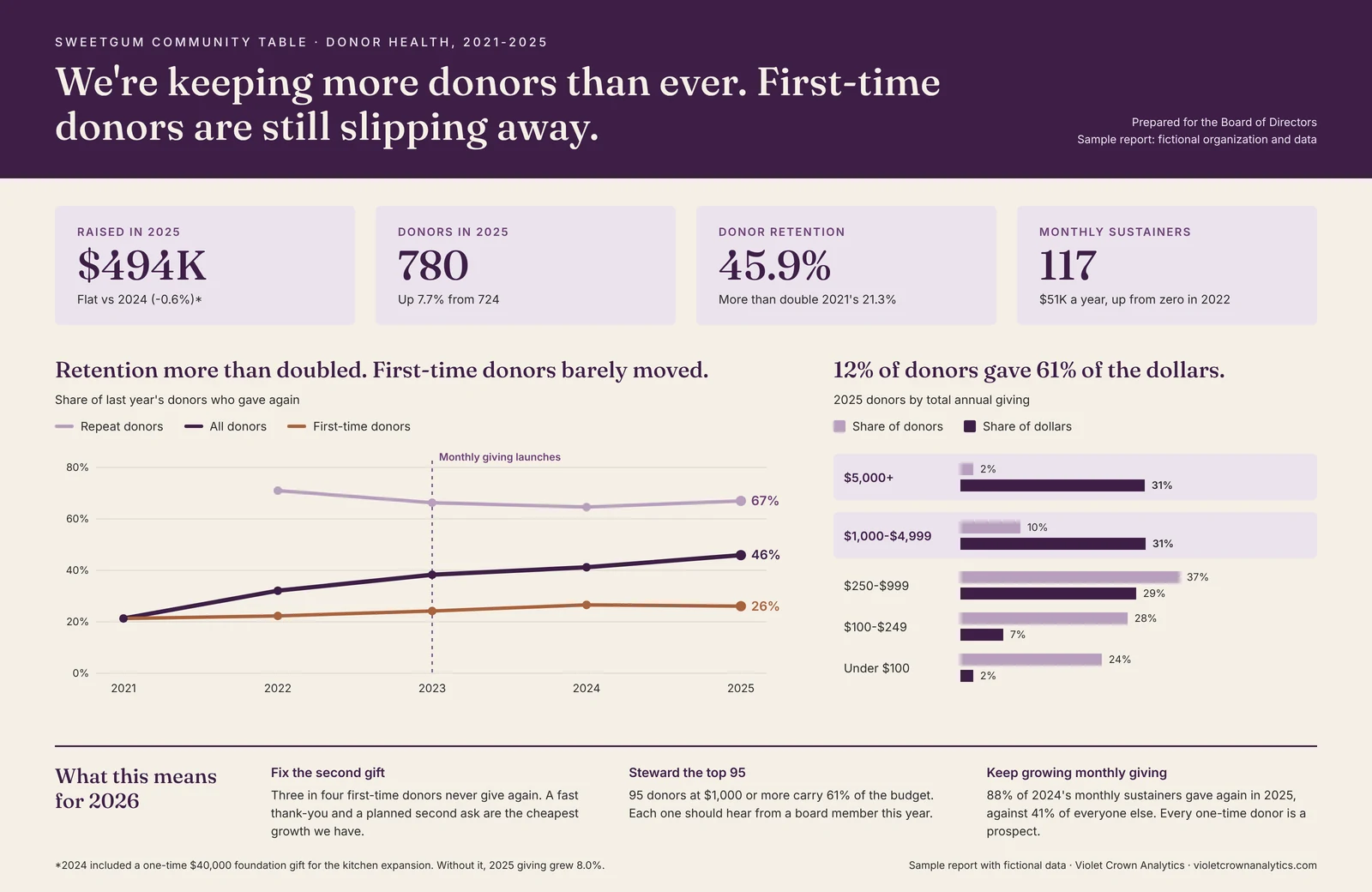
The headline isn’t “total giving was $494,379.” It’s that the organization is keeping more donors than ever, and first-time donors are still slipping away: three in four never give a second gift. The retention chart shows it at a glance, two lines pulling apart. A board can do something about that. Nobody can do anything about a total.
The other chart shows that 12% of the donors gave 61% of the money. Most development directors already suspect something like that about their own file. Seeing it drawn is what turns a suspicion into a stewardship plan.
Grants are the same problem, with a deadline
Grant applications are where this matters most, because a program officer is reading yours alongside dozens of others. They want three answers fast: who do you serve, does it work, and what does our money buy?
This second sample answers all three on one page, for a fictional first-responder wellness program. Who came, by role. How reach grew, from 148 people to 412 in three years. What changed for them, measured before and after. Then the ask, with the cost per person printed right there so the math is checkable: $75,000 serves about 64 more responders.
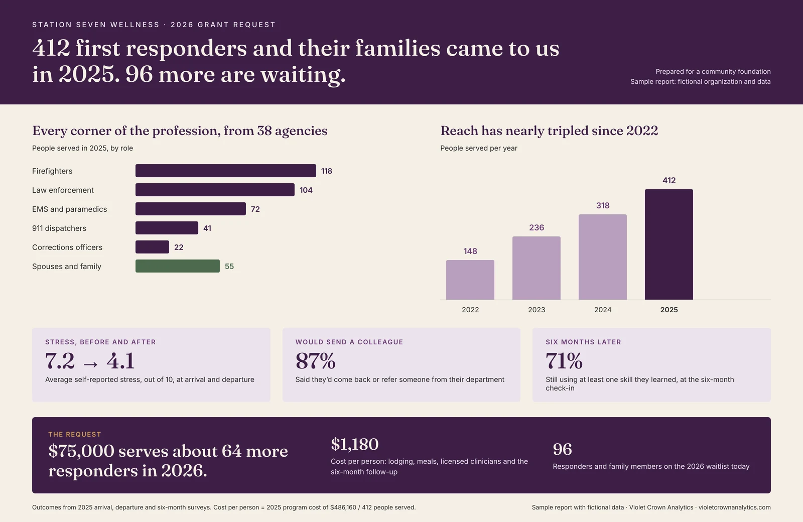
A graphic like that doesn’t replace your narrative. It’s the page in the appendix, the slide at the site visit, the attachment on the follow-up email. It’s the thing a program officer can forward to a committee without rewriting a word.
Same data, different reader
The board wants trends, risks and the decision in front of them. A sponsor wants to know what their sponsorship made possible and who showed up. A corporate donor wants what their gift funded, in numbers their own community-giving report can use. It’s the same database every time. It just needs a different page.
How I build them
I build most of these in Tableau, my favorite tool for exactly this job, and in Excel when that’s what an organization already has and wants to keep. Every graphic comes straight from your CRM, cleaned first, so each number traces back to the gifts behind it.
That last part matters more than the colors. A beautiful chart built on a donor file full of duplicates is just a confident wrong answer.
For organizations on a data retainer, this is the monthly reporting. For a single board meeting or grant cycle, it’s hourly work at the data rate. There’s more on what a report like this covers if you want to see it full size.
I’ll still give you the spreadsheet. It goes in the appendix, right after row 47.